Limitless Laravel 10 Admin & Dashboard Template
Description
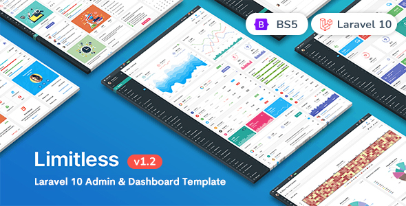
Limitless – Laravel 10 Admin & Dashboard Template
Meet Limitless – Responsive Laravel 10 Admin & Dashboard Template
Limitless – a new professional admin template, based on the Laravel 10.* & Bootstrap framework. Limitless is a powerful and super flexible tool, which suits best for any kind of web application. Includes 1 main and 3 alternative layouts, 1000+ commented HTML pages, 1000+ components with different features and options, 100+ plugins and extensions, etc. Limitless includes a Starter kit – a set of blank pages, that will make your developer’s life much easier. Limitless template is fully responsive, which means that it looks perfect on mobiles and tablets.
Also it is translation ready – you can change the application language on-the-fly and use other features such as fallback languages, language detection, direct access, etc. To see examples, follow the main navigation.
Navigation is a powerful thing here. It supports both collapsible and accordion vertical navigation; multi-level horizontal navigation with state saving feature. Horizontal navigation is used in navbars and mega menus. Navbar component has been extended and added plugins and components support (form components, buttons, links, menus, progress bars, etc.). Mega menu is another song – it can be any color, any width, and include any content.
The overall design is harmonious, clean and user-friendly. Even though the template has a lot of content, it doesn’t look messy and all files and code are well structured, commented and divided. Check out the full list of features and go through all the pages. It will take some time though, but you won’t miss anything. Enjoy!
Please, if you found any bugs or have any suggestions and requests – don’t hesitate to let me know, I will do my best to fix those issues as soon as possible. Support is available: Mon – Fri, 9:00 – 18:00 IST
Limitless Features:
4 pre-built layouts
Main – dark sidebar and navbars, white page header and breadcrumbs line
Second – dark sidebar, light navbar, transparent page header, and breadcrumbs line component
Third – light sidebar, dark navbar, transparent page header. The sidebar is inside the content area
Fourth – 2 navbars, horizontal multi-level navigation, transparent page header
Static layout, fixed navbar, fixed footer, and fixed sidebar layout options
Custom and native scrollbars for fixed elements
Liquid and boxed layouts
Liquid – 100% width, up to 12 columns and up to 4 sidebars
Boxed – fixed centered width, all options from liquid layout
Custom color system includes 16 color palettes
Starter kit for developers – set of blank pages with basic functionality
Form components
Full set of basic form components
Styled and native checkboxes/radios/file inputs, toggles and switches
Input groups in different sizes, colors and components
Twitter typeahead integration, including Bloodhound engine
Elastic textarea
Masked inputs
Input formatters
Password generator and password strength indicator
Characters counter and limiter
Form action buttons
Tags inputs with Typeahead and copy/paste support
Dual multiple select boxes with single and multiple selections
Editable form elements with enhanced support of components and input types
Form validation
12 columns responsive grid of input fields
Vertical and horizontal form layouts
Selects
Select2 select library with advanced options
Bootstrap Multiselect library with different options
SelectBoxIt selects a library with sizing, styling and other options
Bootstrap Select library with live search support
Wizards
Stepy wizard library
Form wizard library
Steps wizard library
Editors
Summernote rich text editor
CKEditor text editor, the most powerful one
WYSIHTML5 text editor
Ace Code editor with 100+ modes, themes and extensions
Pickers
Date & time – pick-a-date, pick-a-time, anytime, date range and jQuery UI pickers with options
Spectrum Color picker with options
Location and address pickers with Google Maps integration
Date paginator – date picker with calendar and pagination
Components
Modal dialogs with enhanced options
Dropdown menus with advanced styling
Tabs and pills components with options
Collapsible and accordion components
Nav component with options
Buttons with styling options and loading spinners/progress bars
Tooltips and popovers with options
Different display options for alerts
Pagination with styling and sizing options
Pager with styling and sizing options
Labels and badges, including styling options
Progress bars in different sizes and styles
Page and component loaders with icon spinners and custom loaders
Thumbnails with titles, descriptions, components and other options
Page header component with supported sizes, styles and elements
Breadcrumbs component with supported styles and elements
Media lists with options
jQuery UI and NoUI sliders with pips, tooltips, color and size options
Syntax highlighter with language options
Affix and scrollspy components
Dynamic tree views with different options and data sources
Context menu extension
Notifications
PNotify notifications library
Noty notifications
jGrowl notifications
Content panels
Panels component with all available options
Draggable and sortable panels feature
Available panel heading components and styling
Appearance
Available text styling
Lists, blockquotes, well blocks, headings, and heading components
Table with available helper classes
12 columns responsive grid demonstration
CSS3 animations based on the animate.min.css library
Icons
Basic Bootstrap’s Glyphicons icon font set
Default Icomoon icon set
Optional Font Awesome library
Extensions
Session and idle timeout tools
Velocity.js animations, including UI pack
BlockUI library for blocking elements
Image cropper with options
Fullcalendar library with styling and display options
Internationalization library with examples and options
File uploaders
Plupload multiple file uploaders
Dropzone single and multiple file uploader
Bootstrap file input – single and multiple file uploader
Sidebars
Collapsible and hideable default width sidebar
Collapsible and hideable mini-width sidebar
Secondary sidebar with appearance options
Opposite sidebar sith appearance options
Left, right, and sticky detached sidebars
Dual and double sidebars options
Light and dark sidebars color option
Hidden sidebar by default
Available components adapted for use in the sidebar
Vertical navigation
Collapsible navigation
Accordion navigation
Optional navigation sizing
Bordered navigation style
Left and right icons positions
Ability to disable certain navigation items
Up to 4 levels, can be extended
Horizontal navigation
Open submenu levels on click
Open submenu levels on hover
Examples of horizontal nav with custom components
Using tabs in the horizontal navigation
Ability to disable certain navigation items
Horizontal mega menu with components and options
Navbars
Single top or bottom, static or fixed navbars
Multiple navbars
Different multiple navbars positions
Navbar as a stand-alone component
Navbar colors options
Navbar sizing options
Top and bottom hideable navbars
Navbar components
Main, secondary, or both navbars fixed
Data visualization
Native D3.js library charts
ECharts library with available chart types
Dimple library, built on top of D3.js
C3 library, built on top of D3.js
Google Charts library
Google maps with options and core features
Vector maps with visualization options
Static tables
Basic examples of available table options
Table sizing options
Table borders
Table styling
Table components
Responsive tables
Data tables
Basic initialization examples
Datatables styling
Advanced examples
Sorting options
Datatables API usage examples
Data sources examples
Responsive data tables
Columns reorder extension
Fixed columns extension
Columns visibility extension
Table tools extension
Scroller extension
Custom pages kit
Task manager – list and grid display options, detailed task page
Invoicing – static, editable invoice, invoice grid, and archive
User cards and user list
User profiles with and without a cover image
Simple and advanced login forms
Simple and advanced registration forms
Unlock user, and password recovery forms
Login/registration styling options
Left, right and centered timeline
Chats layouts and color options
Knowledgebase and FAQ pages
Search pages kit – mixed, users, images, videos
Media gallery with optional titles and descriptions
Set of error pages – 403, 404, 405, 500, 503 and offline page
Continuous development
Regular updates
Fast and professional support
1. All digital products are the most recent version, with no possibility of free updates. After payment, you can request an update to the most recent version for 7 days if a new version is released. Get free support within 7 days.
2. After the purchase is confirmed, download links will be available for 7 days. If a license is required, please contact us via email or ticket for assistance with activation. Our license is only valid for activation and does not include support.
3.mailto:contact We provide Mobile, PHP script installation services for $19.90. Please create a backup after installation as we do not support re-installation. For mobile app source code, we do not offer installation services.
4. If you have any questions, please contact us by email contact@gplodoo.store or create a ticket on this page
5. Please note that any digital products presented on the website do not contain malicious code, viruses or advertising. You will receive the original files from the developers. We do not sell any products that have been downloaded from other websites.
6. The response time can last up to 6 hours.